Background
A few weeks ago I was in New Zealand but more than that I was driving in New Zealand on the left hand side of the road.
The bar for driving on a side of the road you've never driven on is quite low. The rental car agent basically said "just go slow" and handed over the keys.
Overall, driving on the left wasn't too bad. With some deliberate brain power applied to driving it was pretty chill and yes people we're polite about me going slow sometimes.
The real hurdle was the roundabouts. I'd never done so many in my life and grew to find a new appreciation for them. Sadly, I don't feel the appreciation is transferable. Americans as a population just don't get roundabout. They were nice when everyone knew the rules and I could trust they did, but not so in America. I'll keep my high skepticism with US roundabouts.
Anyhow, I was taken by these driving side differences and sketched out a rough game of it on the 14 hour return flight home.
Once I settled on the name Re:Turn it was all but guaranteed I had to work on it. My fondness for the anime Re:Zero coupled with my desire to build out my Re:* portfolio of games is very strong.
The first thing I wanted to tackle once I had the basic mechanic was the game layout. Since I make games for the browser and aim for them to be responsive on desktop, mobile, and everything in between, a good layout scheme is essential to get right early in the process to reduce iterations.
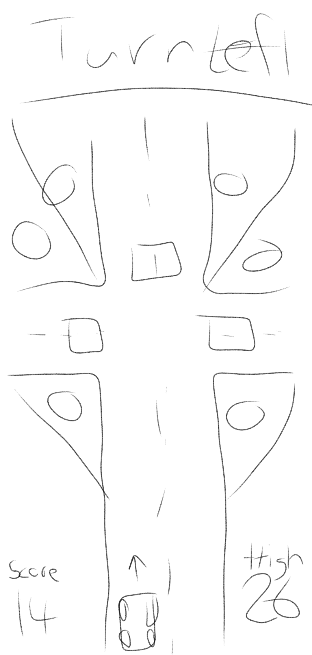
I sketched this initial layout and was happy enough with it to jump into the code once I had the time to do so.
Development
My game development is done using:
- Typescript
- Raj
- React (unless I use canvas or perf becomes prohibitive)
React was up to this task. In this game what's novel is the use
of an HTML table to make the game's layout. I really leaned into
letting the table do the work whereas in most games it's more a
matter of using CSS position wizardry, lots of fake
div elements, and other tricks.
Here's the table with borders so we can see how it works more clearly:
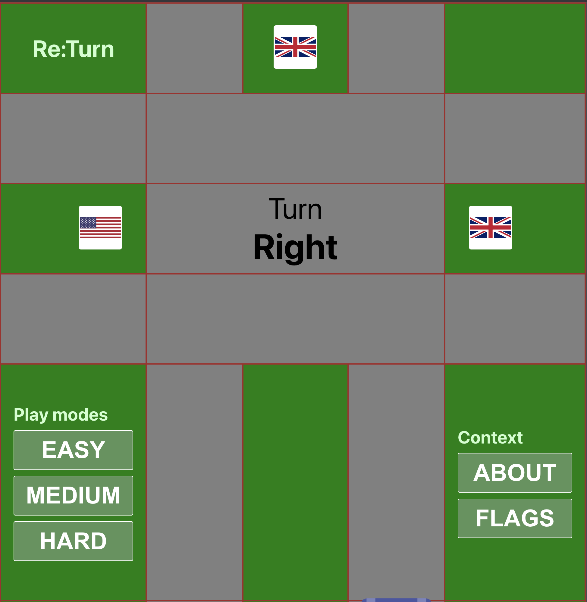
Notice that sick, sick colspan usage. I'm so proud.
If you look at the source code, you'll note I really did jam most of the game except the context pages into the table shape. An efficient use of space I must say.
I barely knew what side of the road New Zealand drove on before planning the trip. Luckily Wikipedia has a comprehensive, easily scrap-able table of countries' driving sides I was able to use.
The game features a ton of country flags and I was happy to find
NPM package svg-country-flags
and plug it in to provide the authentic flags. Thanks to this
repo the game had a lot more variation and complexity to deal
with which led me down the path of creating modes (initially
only easy and hard).
I generally don't use modes in my games. I try to keep the experience of playing my games ~fair to everyone playing and not worry people with which mode they ought to be in. But there's just so many flags I could use, so I did.
Medium mode came about as a means to let people flex some of their flag skills but not need to be an outright god like in hard mode.
The other game graphics I designed by hand in my super old and non-renewed version of Sketch. I am particularly happy with the top-down view of the car:
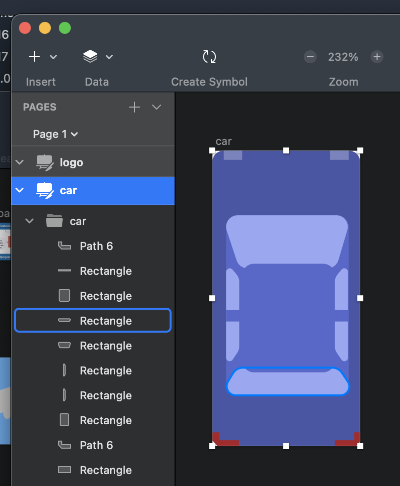
It's nice when people recognize a picture of a car as a car quickly.
User testing
Where would a game be without people pointing out problems? In initial play tests people found a few things confusing:
Go forward instruction
I wanted the driving experience to mirror that of a GPS or navigation app. These programs don't say at every intersection "go forward" because that would get old quickly. So in my first iteration when instructed to go forward there was no instruction to do so.
This was confusing to testers and I made the compromise to add the forward instruction. The experience is jarring enough as it is for new players and it was a quirk that would fade from an intermediate player's mind anyways.
Revising easy mode
I began building the game before I had found and integrated the flag set I ended up using. Because of this for easy mode I simply used pictures of the letters L and R to indicate what side of the road to turn into.
This was super confusing and it led me to advise playing medium mode first and then play easy so the player had a sense of the flag mechanic. For a lot of people, this feels roundabout. I revised to make easy mode use some of the more common country flags so that all the modes were now consistent.
Click-here animations
When the game started people didn't know what to do with regard to controls. This is especially true on desktop where you might think the keyboard is at your disposal. So a tutorial-like animation plays on the first point of the game to highlight the clickable areas to get someone started.
Parting thoughts
- I'm happy with this new edition to the Re:* game franchise.
- I enjoyed how quick and easy it was to iterate with the tech stack as usual.
- Shout out to Wikipedia and open source for providing the knowledge and assets to make this game possible.
Thanks for playing and for reading!